WE DO
Role: Product Designer
Project Type: Academic
Timeframe: 10 Weeks
Tools: Pen & Paper, Sketch, Figma & Invision
“We Do” is a wedding app to create tasks, manage deadlines and invite others to be part of a bride’s wedding plans.
The Design Process
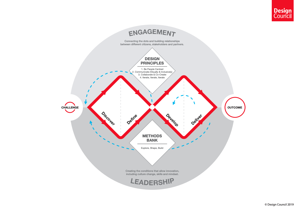
This 10 week project was my first end-to-end process utilizing UX/UI design. The project followed the Double Diamond framework. This framework allows a designer to systematically discover and define a problem, empathizing with those impacted. Once the problem is clearly defined, a designer is able to develop and deliver a synthesized solutions through ideation, iteration and testing.
DISCOVER
Why Weddings? (Problem Space)
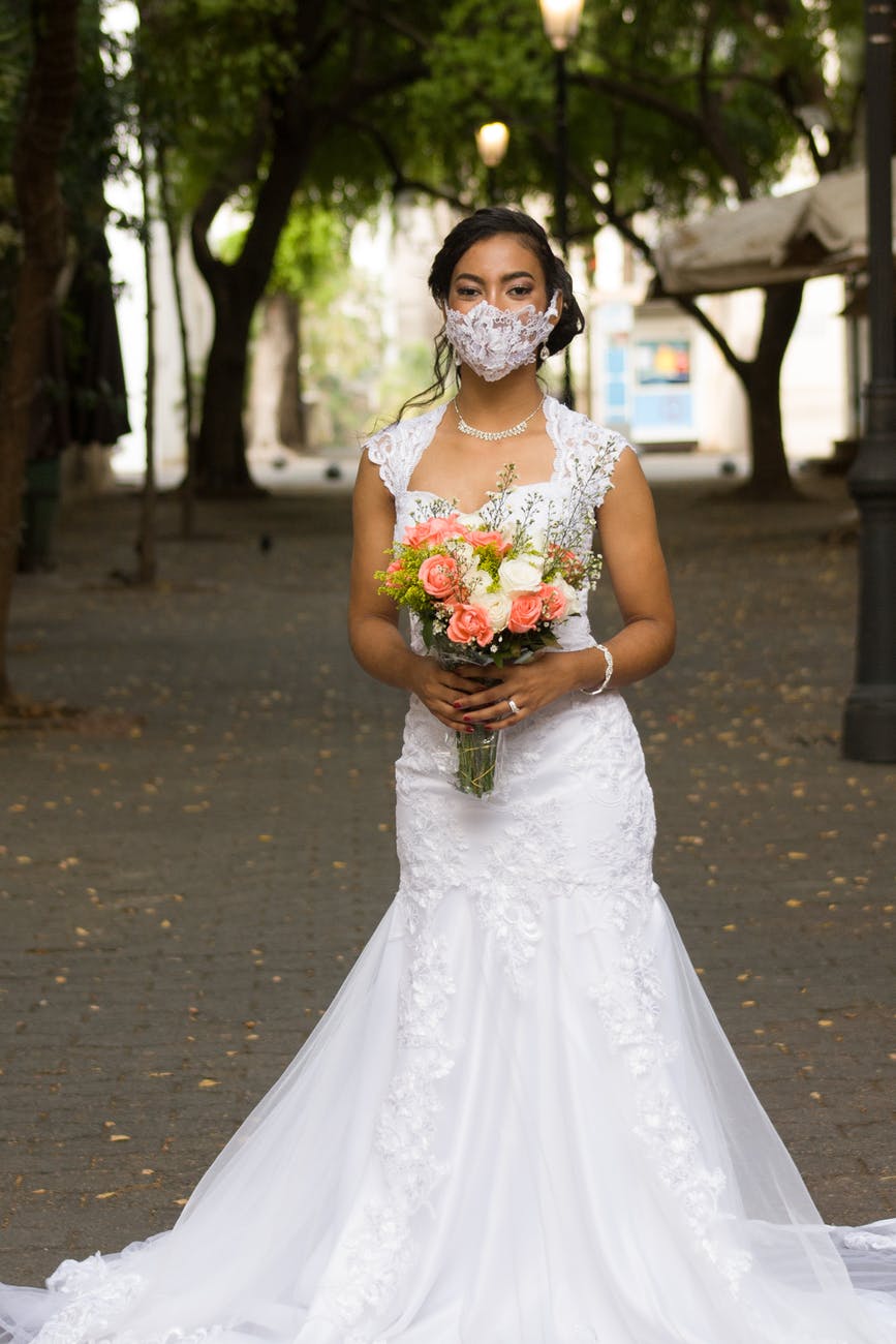
My motivation for this project was tri-fold -- personal, observational and timely due to the impact that COVID-19 was having on the wedding industry. My fiance and I were one of many couples affected by the pandemic’s shake up of their wedding plans. I experienced first hand the constant change in restrictions where wedding plans would be made and then need to change quickly in order to respond to the external forces impacting our plans.
A bit of intial research supported the presence of this problem:
In April of 2020 marriage license applications dropped by over 50% in most Canadian provinces.
A Wedding & Events Operator in BC estimated to the CBC in May, that around 75% of her clients had opted to or were planning to postpone their wedding plans.
I consistently observed couples struggling to manage the changes to their plans. Couples had either drastically reduced the scope of their wedding in a short time frame, or postponed the celebration to a later date without much certainty of what the future would hold. I noticed how challenging it was to handle both the diverse range of details and people that were involved in the process of making the big day happen.
Before diving deeper into research, I laid several key assumptions about the problem and my prospective users.
Brides need to track, analyze and predict outcome of wedding decisions and dialogue about them with relevant people (wedding party, venue, family, guests).
Brides want consistency, dependability, clarity and trust.
This perspective helped to set the guiding question for my project to explore:
How might we streamline communication and decision making in order to help wedding-planning couples navigate unexpected event changes (due to COVID 19)?
DEFINE
Interviews & Insights
In order to further understand the problem space, I conducted 5 interviews to gain insight into current behaviours, pains and motivations of brides in their early 20’s to early 30’s who were planning their wedding during COVID-19.
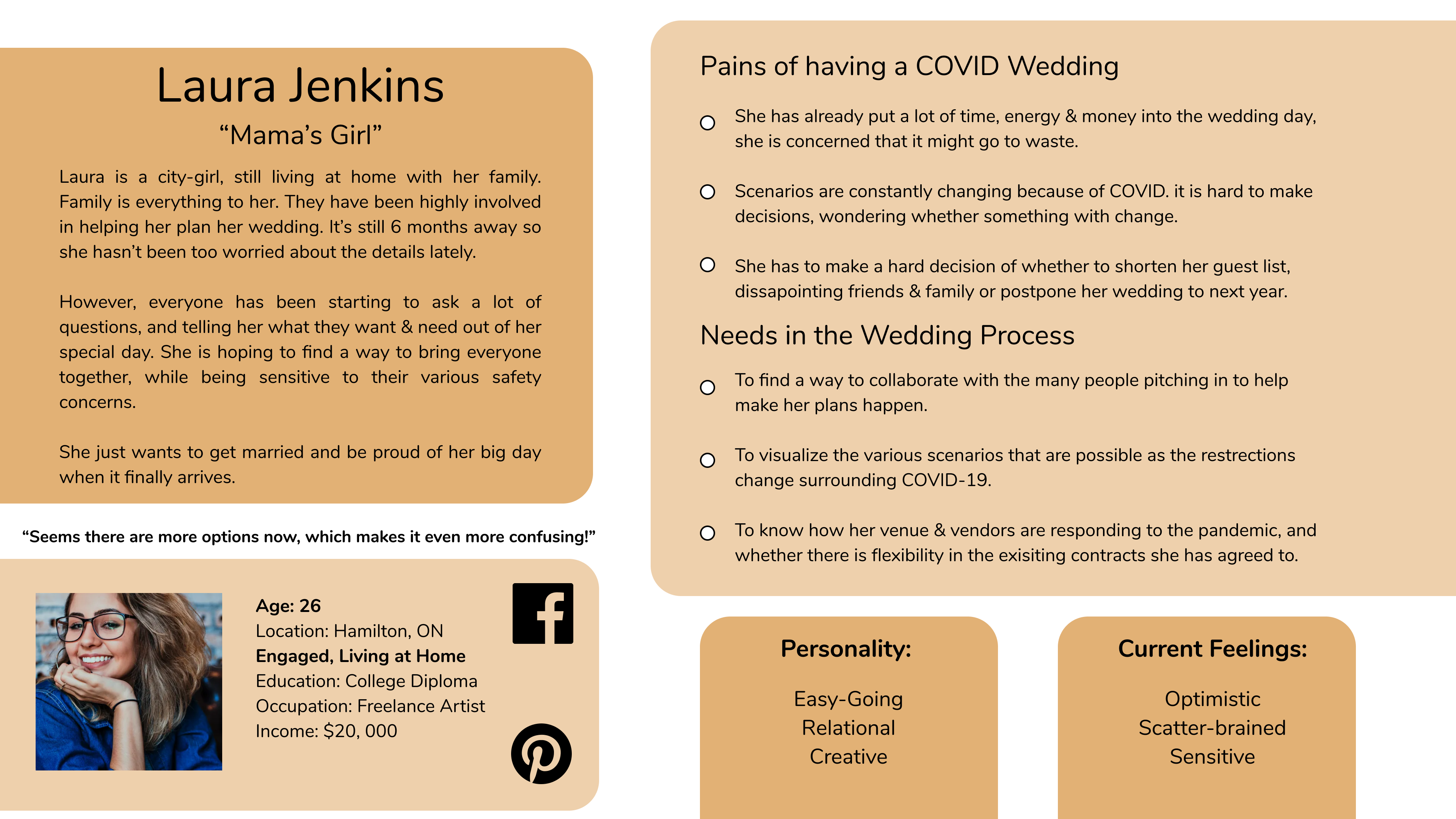
Persona
The creation of a persona profile illustrated the crucial elements of my interview participants and their experiences.
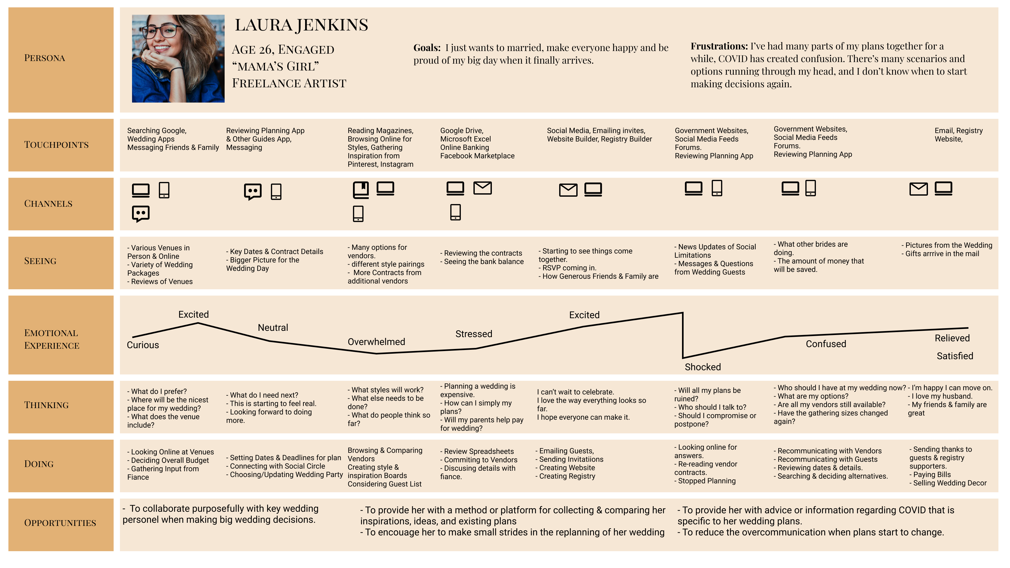
Experience Map
The experiences of my interview participants were further analyzed through the development of an experience map depicting the emotional roller-coaster of planning a wedding, made even more challenging by the COVID-19 outbreak that impacted everyone’s lives beginning in the Winter of 2020.
Developing the experience map made it clear that there were two points in time to intercede during the wedding planning process. Brides could be assisted at the early stages of planning process in getting a strong handle on their specific plans and they could also be helped while managing through the changes to their plans caused by COVID-19.
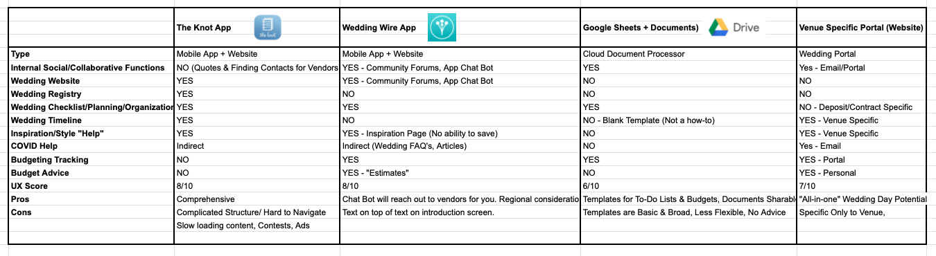
Market Analysis
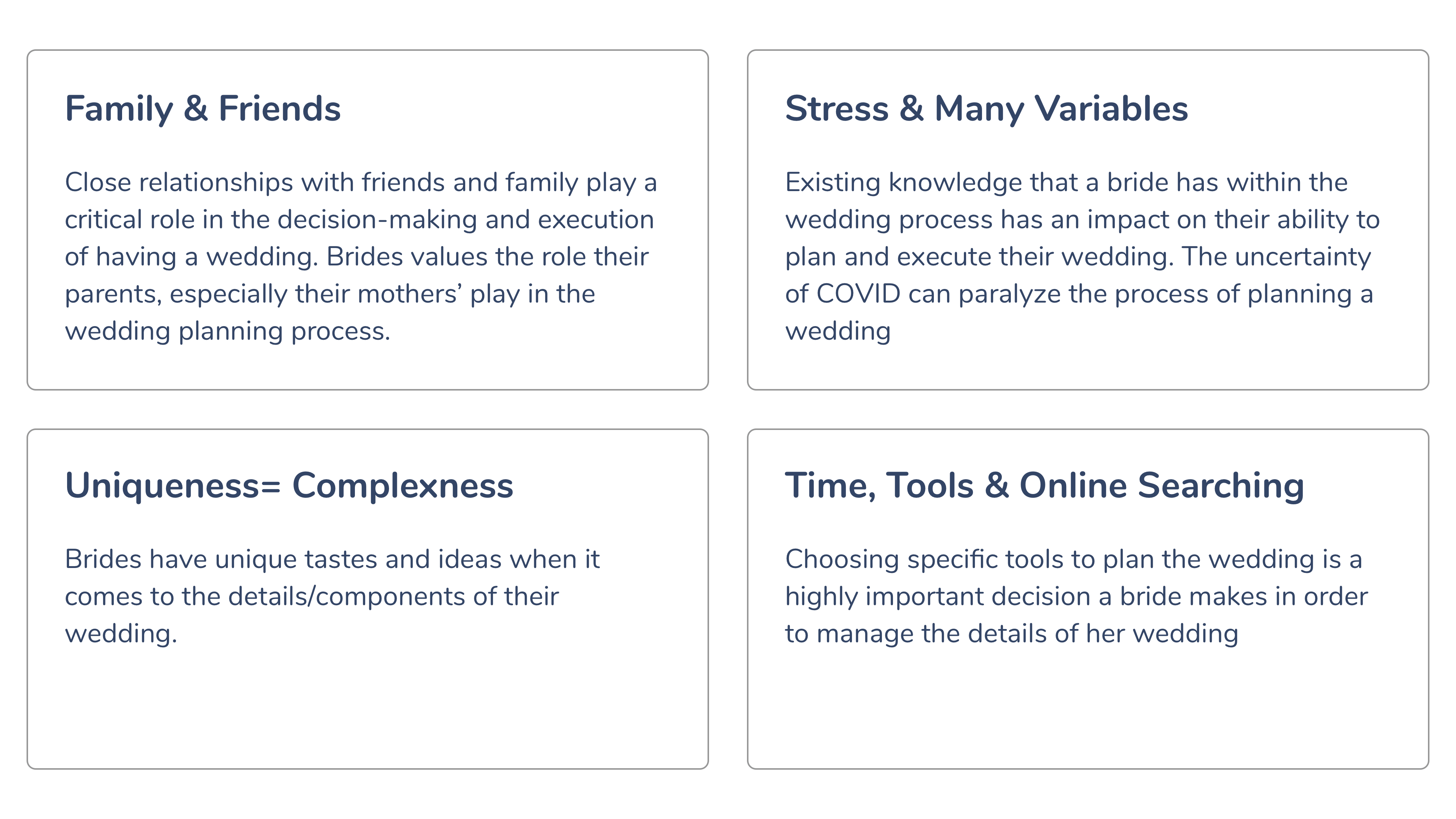
Given that the design challenge was to create a mobile app, at this stage I decided to review existing tools in the market and the offerings that were available to brides for managing the details of their wedding. I took a closer look at wedding planning & collaboration applications such as Wedding Wire, The Knot, the Google Suite and a venue specific planning portal. I analyzed how these tools and apps performed against the themes and insights that were discovered through the interviews. These findings help to inspire the direction that I would go with designing and building my product.
Observation #1
There was an opportunity for me to create an application that enabled specific communication and collaboration between brides and other key stakeholders in the wedding process pertaining to specific plans and tasks. In some cases, other applications enabled brides to identify and connect with vendors, but the process was largely focussed on advertising and selling vendors services, and less on the particular interests and plans of a bride's wedding. Other applications offered many features to the user (budgeting, checklists, inspiration, and searching for vendors) but I sensed that they offered too many features that would overwhelm the user. Given my understanding of how unique and individual each bride's wedding is, the applications 'one size fits all' and 'all in one' approach seemed to be in opposition to how a bride would both create and customize tasks as well as collaborate on them with others.
Observation #2
It was difficult to see how the existing infrastructure of competitor's applications would accommodate brides who were scrambling to manage and communicate their rapidly changing plans amidst the COVID-19 pandemic. Information was general in nature and not specific to a brides existing wedding plans. Brides had a steep learning curve to understand all the impacts that the virus would have on their plans, leaving them feeling overwhelmed with information.
Task Selection
How did I decide what I was going to build?
After identifying areas of opportunity for my application and the key moments in the wedding process, I began to author a series of user stories & user epics. These stories & epics helped to align what brides want and how as a designer, I would be building the application for the user.
Inspired by interview insights, I created thirty user stories that were organized into three epics:
- Connect & Collaborate
- Organize & Design
- Budget
Connect & Collaborate seemed to be the strongest thread between all of the user interviews. Interviewees highlighted the involvement of other people - something which competitors were not offering in their apps. As an added layer to that communication pain - brides were becoming worn out from revisiting and re-communicating the same details & conversations multiple times.
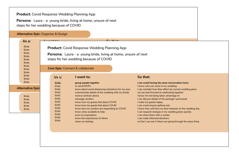
The following user story captured this sentiment:
As a Bride, I want to group people together, so that I can avoid having the same conversation twice.
I realized I couldn't fix COVID-19 and I needed to give brides something tangible that would allow them to easily see where they were in their plans and help propel them forward in a positive way.
These many considerations & insights directed me towards two main features for the application - chat/discussion functionaility and task management.
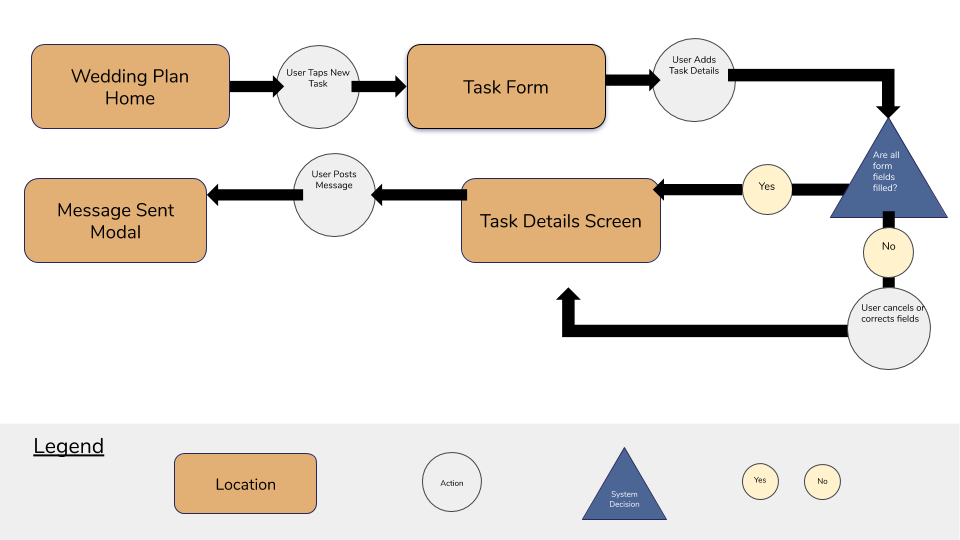
The Pivot
At the time I had developed a task flow that placed equal emphasis on the flow of these two main features. I later revised the task flow to give the creation and management of tasks a higher priority over the discussion. I came to the realization through revisiting the inspiration board, further sketching and discussion with design peers, that chat functionality could be embedded into individual tasks.
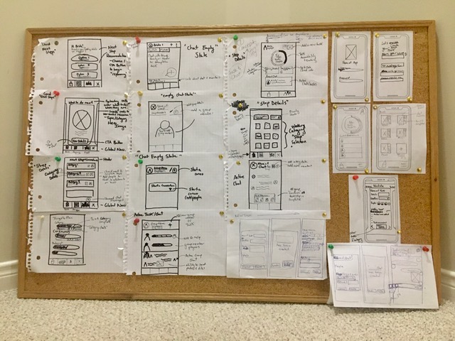
Early sketching efforts and a set of information heavy wireframes reflected how large the scope of my solution and flow was at the time.
DEVELOP
An Improved Concept
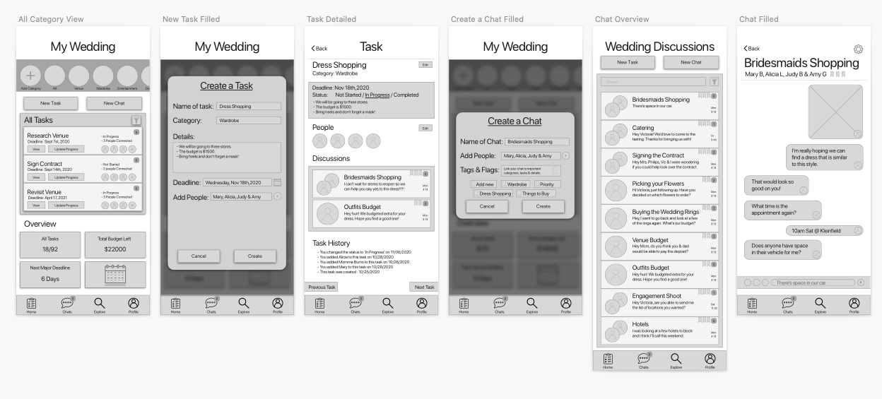
With a clearer sense of direction and inspiration I developed improved sketches which focused on presenting less information thus decreasing the cogintive load when a user first opens the application. This then led to a new set of wireframes which I was able to begin testing with prospective users.
Usability Testing
Two rounds of testing were conducted with five individuals per round to measure the usability and functionality of the app, specifically focusing on users abilities to create wedding tasks and message members of their wedding team (friends and family) from within a task. Tests users were brides or individuals who had first-hand experience with planning a wedding.
Round 1 Summary: Users were able to navigate their way through creating a task , but expressed a lot of confusion regarding the information hierarchy on the home screen. The majority of users also did not realize there was a chat function within the task or know how to use it as I had intended.
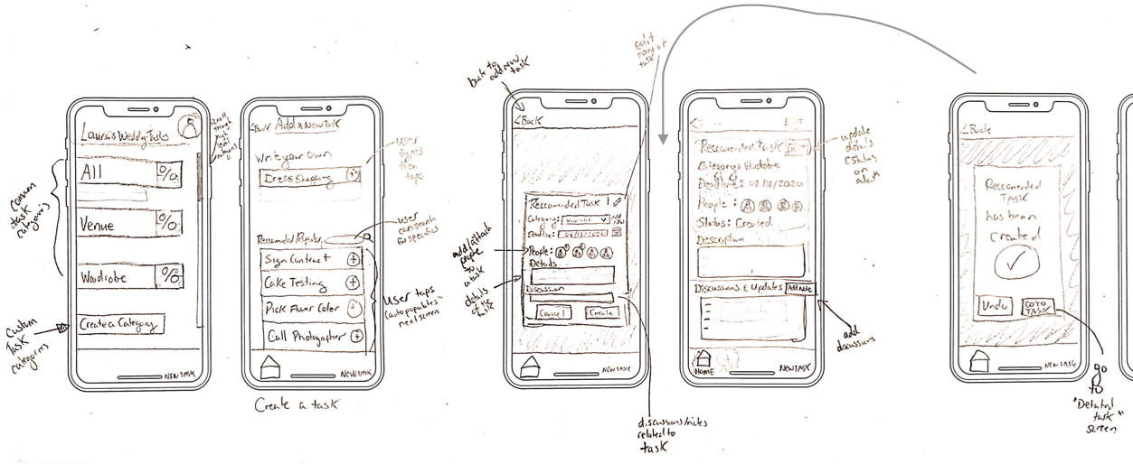
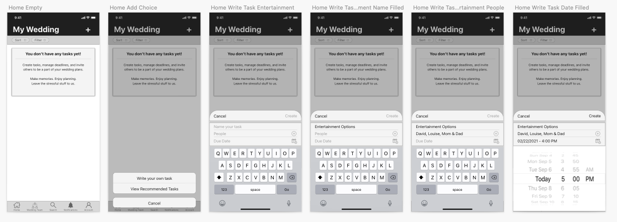
Between round one and round two I sketched and designed another set of wireframes which involved a significant overhaul of the home screen, increasing iOS design conventions and refining form fields to progressively disclose important information to users.
Round 2 Summary: All of the test users were able to complete both the tests of creating a task and sending a message within that task. This was a meaningful outcome considering how far the concept had come since the first set of information heavy sketches and wireframes.
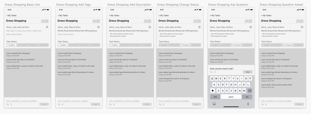
There were some minor issues during this round of tests. Some users had trouble distinguishing the difference between a few of the secondary form fields within the 'Task Details' screens. Deeper discussion brought to light that the cause of these troubles were likely the result of how some pieces of information were grouped together or separated.
Prior to applying branding and inserting colours into designs, I rearranged how form fields were ordered and increased text sizing to improve both comprehension and accessibility of the designs.
DELIVER
Visual Design
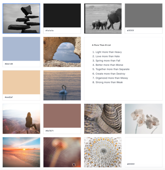
Drawing from the insights from my interviews with brides, my goal in the visual identity and branding was to give brides a sense of positive collaboration while feeling efficient.
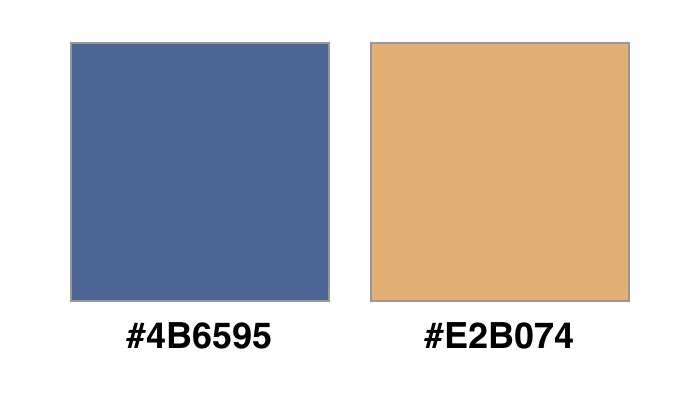
I chose a light blue for a professional, efficient and structured look. It initially had a much lighter tone but after reviewing the accessibility, I determined that I needed to go with a darker more accessible tone.
I chose a light orange colour to reflect friendliness and warmth. It was an added bonus as it also helped to reflect brides confidence, vibrance and unique personalities when planning their own weddings. The orange was also limited in terms of accessibility, so I knew I needed to use it sparingly in my designs.
Brand Name
I worked through brainstorming and testing many names that would help to describe both collaborative management of tasks, as well as the app’s relation to the wedding process.
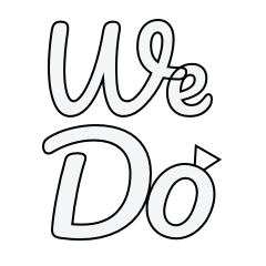
The final result was the name, ‘We Do’ which helped to highlight the collaborative nature of which brides would be organizing and executing tasks, as well as pay homage to the long used phrase in weddings of ‘I Do’.
The name was sketched and digitalized in many ways in order to work towards establishing a wordmark, logo and application icon.
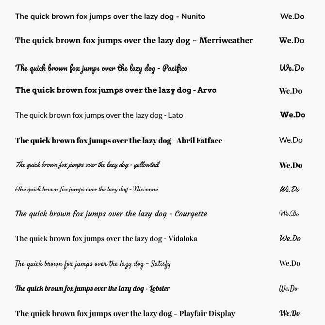
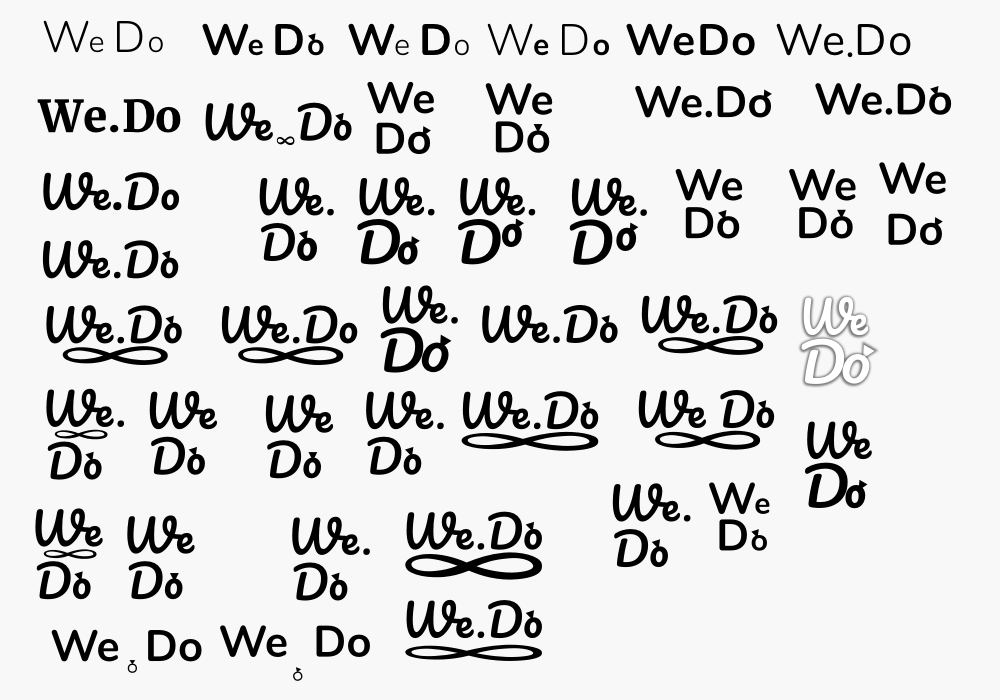
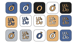
Wordmark, Logo & App Icon
I explored many rounded, san-serif font types and eventually settled on "Pacifico". The rounded text reflected the caring, friendly, collaborative and flexible task side of the application's mood.
Given that the name of the app was quite short, I was happy that I was able to add the subtlety of a wedding ring through the addition of a triangle and resizing the O. I injected the brand colours into the wordmark & logo, trying many variations and decided to go with the white background and orange writing. It aligned with the purity and the lightness associated with weddings.
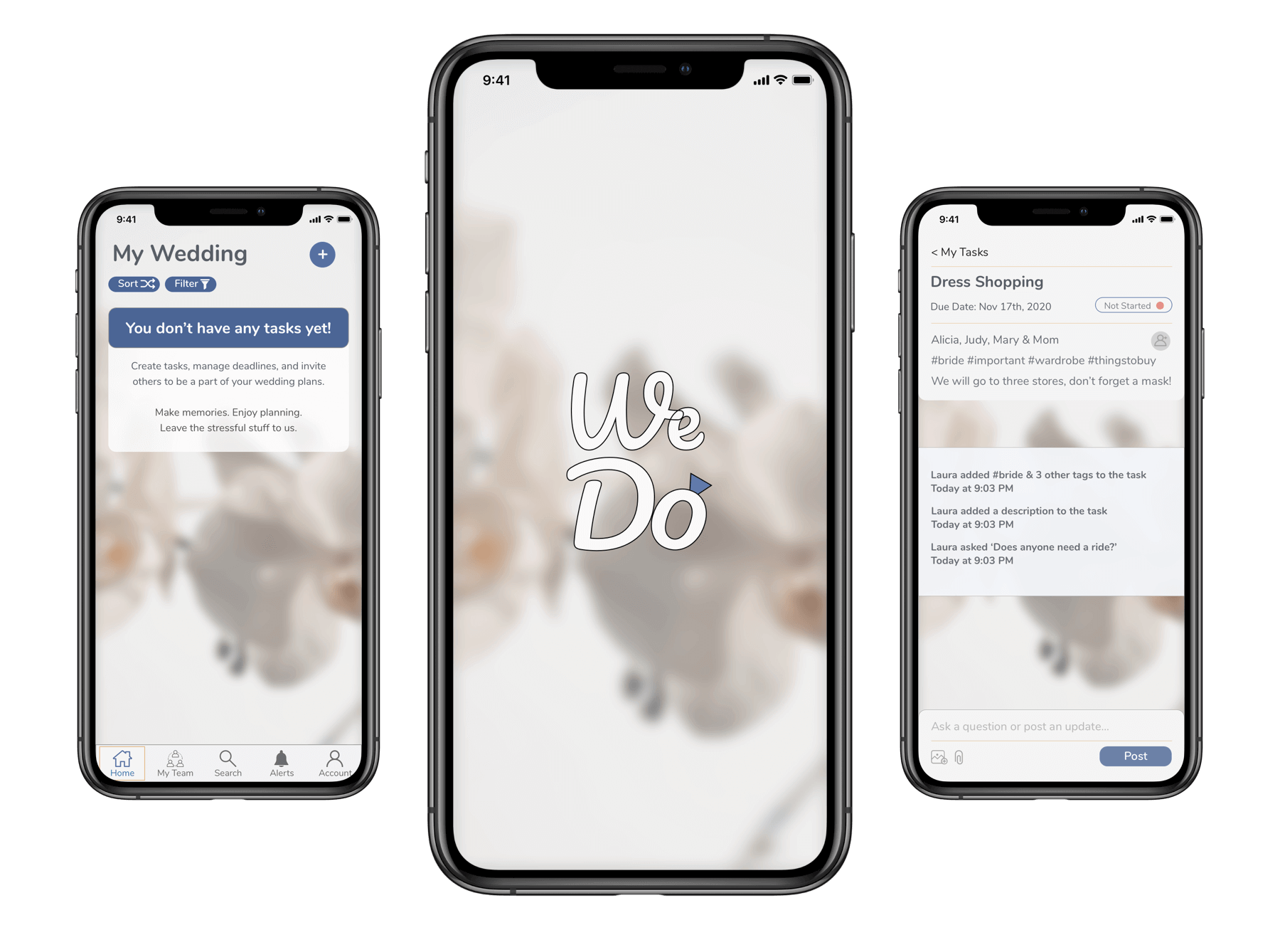
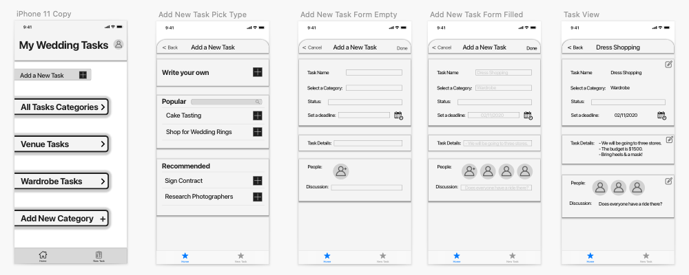
High fidelity Prototype
Having sketched, built and tested wireframes and an established my brand's identity, I finally had the necessary pieces for creating a high-fidelity prototype!
Try it out!
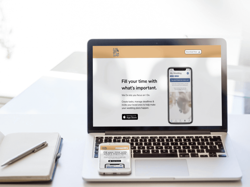
Product Marketing Website
Building off of the progress of completing the high fidelity prototype, I moved into thinking about and exploring how my app would be presented to brides ages 20-30 through a responsive marketing website. This project was another great opportunity to work through the process of finding inspiration, sketching, wireframing, testing and bringing designs into high fidelity.
Multi Platform Challenge
In another challenge beyond the high fidelity design, I took the intial application experience a step further by translating it's core functionaility into other platforms and devices. For this half-day design challenge, I chose to develop a simple flow for an Apple Watch for my persona Laura - a twenty-six year old bride.
In the interview phase of my project, brides highlighted the importance of selecting the tools suitable to their needs and their situtation. A We Do wearable experience means that brides can take their plans wherever they go.
The design allows brides to view task details and create simple voice updates and messages. Although Brides may not be able to create new tasks from the current iteration of the watch concept, they won't miss out on any of the fine details as time quickly rushes forward in the wedding planning process, especially as situations have rapidly changed with COVID.
Design Impact
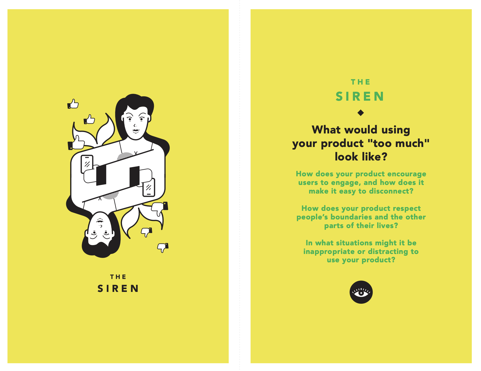
As the structured portion of this project wound down, I took time to reflect on how my designs might impact the world if they were to be put into development. I completed a Tarot Cards of Tech exercise to assist me in considering how the technology might afford opportunities for future change and identify possible unintended consequences of the We Do app.
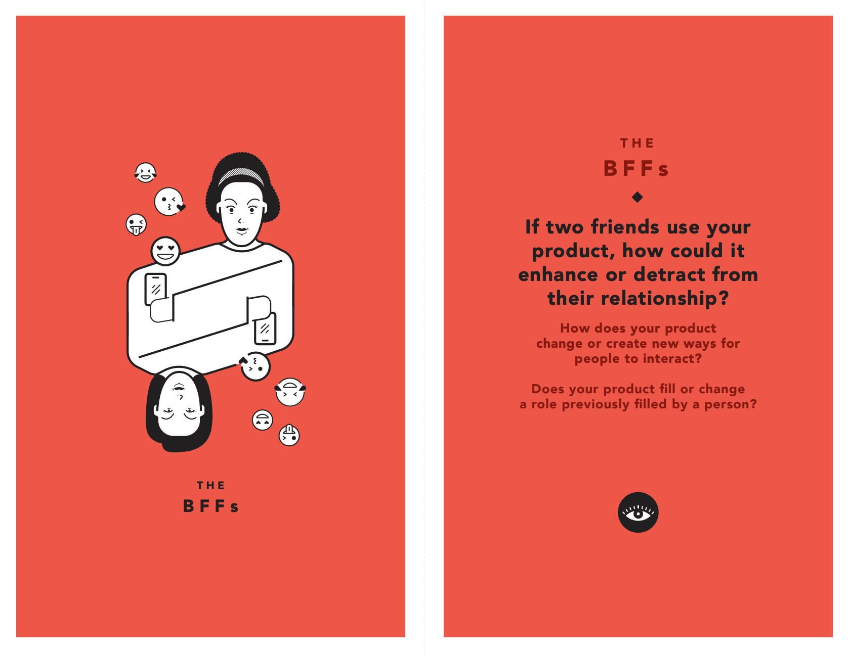
The BFF: "If two friends were to use this app..."
- Enhance: The We Do app might help them maximize the wedding experience for one or both of them and may bring focus to the wedding plans so they could enjoy the process together rather than be caught up in all the chaotic and overwhelming details.
- Detract: Too many cooks in the kitchen - more app users means more opinions -- brides should chose carefully who they want to include in their conversations and tasks.
The siren: "What would using your product too much..."
- Using the app excessively might create conversation tension between a bride her contacts.
- Constant notifications and updates on tasks could cause a strain on relationships.
Final Thoughts
There is much more that could be said about my experience in taking this application and project from beginning to end but instead I'll summarize them into a few key thoughts and ideas.
In the future a few things I would like to incorporate in my app are:
- Considerations for how people add or are added to join the app
- Exploring how users might connect to & coordinate tasks with vendors and venues within the app
- Tracking and executing their wedding budget through the app
Key Learnings & Project Takeaways:
- Details are important for informing & empathazing - but don't underestimate the power of synthesis.
- Done is better than perfect - seeking perfect takes the fun away from ideation & iteration.
- Seek feedback from peers, mentors, and users - early & often. Don't be your own critic.